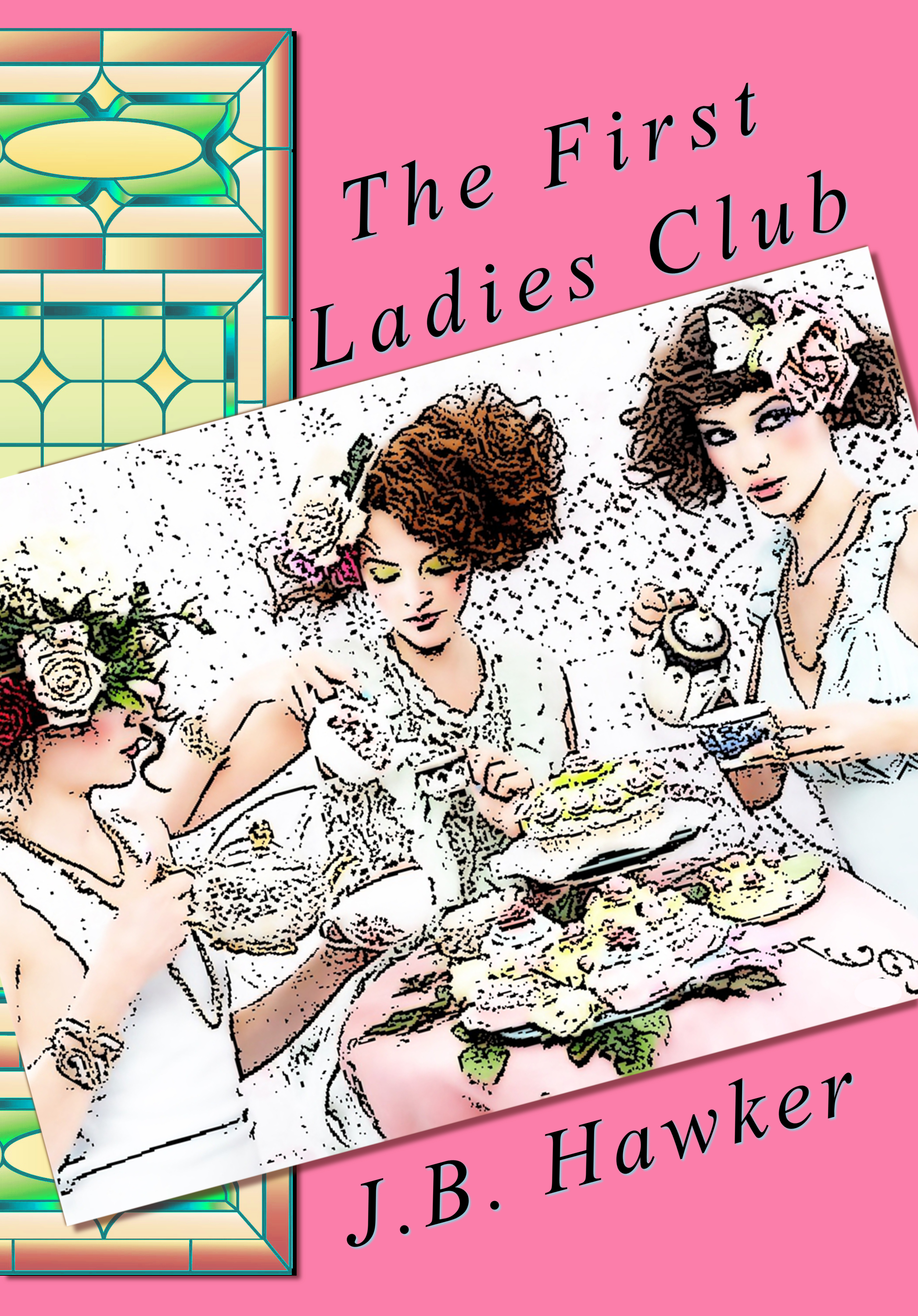
Cover Design Update: Back to the Drawing Board

Thanks to all who provided input on the proposed cover design I posted.

Everyone who responded seemed to feel strongly about it, some favorably and some not-so-favorably. The colors, style and illustration gave a few people the idea the story was a romance set in an earlier era. As the book is a contemporary mystery/thriller, it was not the impression I was going for.

This was really helpful information.

It is good for a cover to provoke strong feelings, but it is not good to confuse the readers or set them up for disappointment when the cover is a mismatch for the style or genre of the book inside.

While we may not be able to accurately judge a book by its cover, most potential readers use a book cover to assess whether the book will be to their tastes. A cover can make or break a book, and can be as important as the story inside.

So, out with that cover design and back to the drawing board.

Learning by doing

An author exposes a piece of him or herself with every published work.

As independent authors, we are also displaying the learning process we are going through. Beginning with our first efforts at self-publishing our every typo, formatting error and novice blunder is available for the world to see.

When I published my first book, Hollow, I had no plans for a second book, let alone a series.  Readers wanted to know more about what happened next to Bunny and Max and urged me to write a sequel. That led to a four book series, basically chronicling their relationship, midst the murder and general mayhem.

It’s been great fun and I’ve learned a lot along the way.

Because I wasn’t planning a series, and because I was learning more about how to create a good cover as I went along, my covers in the series are not cohesive. Just looking at the books on a shelf, there is no family resemblance to jump out at the readers to let them know they are a series, as you can see from the covers displayed on the header of my blog.

I am considering having the covers re-designed as a series and would love some feedback on which element or elements should be consistent on each of the new covers.

Any and all feedback will be read, considered and appreciated.